
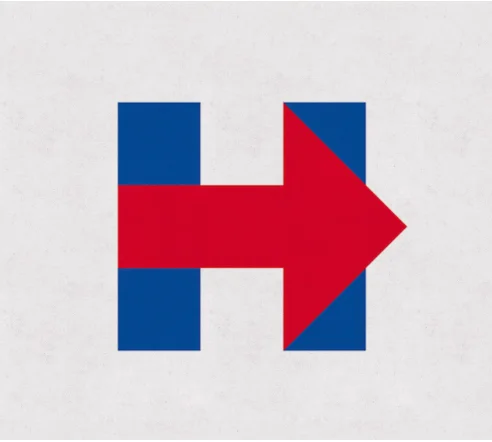
This is not a political post. This is a post about a logo that has been designed for Hillary Clinton, who officially announced she's running for office. The official logo is above. It bugged me when I first saw it and I wasn't sure why. After thinking about it all day, I have formulated a critique and also some new design options for her consideration.
1) It looks like a hospital sign merged with the FedEx logo. While there's nothing wrong with simple, this looks too similar to things I've seen.
2) Why in the world is that huge bulbous arrow pointing to the RIGHT?
3) It looks as though it is going to fall over to the RIGHT.
Hillary, I'm sure you were advised that you need to go with a strong logo. It needs to show movement and progress (to the right??). It needs to be strong and assertive and red white and blue. I agree with all of these statements but this logo just isn't working.
Here are a few ideas I have for you:

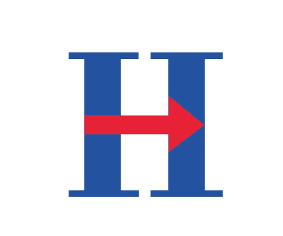
With just a minor tweak of reducing the size of that arrow, this option is not off balance yet retains the feel of your original logo.

If you were willing to depart from the RIGHT arrow (why to the RIGHT, Hillary??) then you might want to consider something like this. Progress. Moving up. Upward movement. Less obnoxious arrow.
What about this? Bodoni is a strong typeface. If your designer only showed you sans serif options, they did you a disservice. Serifs are strong Hillary! They even look like columns. Justice. Fairness. With a little more style and flair.
Anyway, Hillary, I'll be crossing my fingers that your logo is a work in progress. In the meantime, feel free to let me know if you'd like to use any of these concepts instead of the logo you unveiled today.